Search Knowledge Base by Keyword
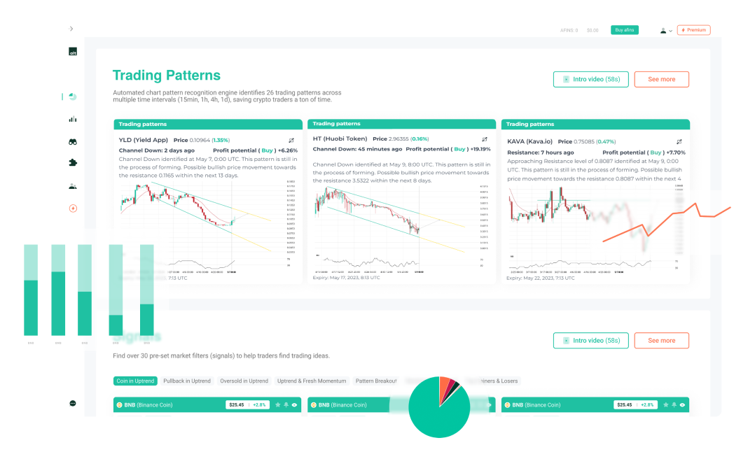
Crypto Chart Patterns
Chart patterns are visual formations created by the price movements of an asset on a chart. They help traders anticipate future price direction based on historical behavior. In crypto trading, recognizing these patterns can signal potential breakouts, reversals, or trend continuations—crucial insights for making informed decisions.
altFINS takes the guesswork and manual effort out of this process with its automated chart pattern recognition engine, which scans the market 24/7 and identifies 26 powerful chart patterns across multiple timeframes (15 min, 1h, 4h, 1d). Whether you’re looking for classic formations like Head and Shoulders, Triangles, and Flags, or advanced harmonic patterns like Butterfly and Gartley, altFINS detects them instantly—saving traders time and uncovering opportunities others might miss. Learn how to trade Chart Pattern in our Crypto Trading Course.
26 AI Chart Patterns Explained
altFINS’ automated chart pattern recognition engine identifies 26 crypto chart patterns across multiple time intervals (15 min, 1h, 4h, 1d), saving traders a ton of time, including:
-
-
-
-
- Ascending / Descending Triangle
- Head and Shoulders, Inverse Head and Shoulders
- Channel Up / Down
- Falling / Rising Wedge
- Double Bottom / Top
- Triple Bottom / Top
- Bullish / Bearish Flag
- Bullish / Bearish Pennant
- Rectangle
- Support / Resistance
- Big Movement
- Consecutive Candles
- Drive
- Butterfly
- Gartley
- ABCD
- 3 point Extension/ 3 point Retracement
-
-
-
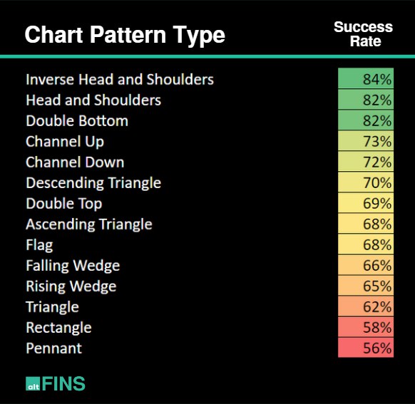
Success Rate of Crypto Chart Patterns

Key Highlights:
The most reliable patterns include:
- Inverse Head and Shoulders (84%)
- Head and Shoulders (82%)
- Double Bottom (82%)
These patterns are known for signaling strong trend reversals, making them valuable for spotting market turning points.
Channel Up (73%) and Channel Down (72%) also show high reliability, indicating the strength of trend continuation patterns.
Patterns like Pennant (56%), Rectangle (58%), and Triangle (62%) show lower success rates, often requiring additional confirmation before trading.
Watch this short tutorial on how to use Chart Patterns
Patterns that emerge over a longer period of time generally are more reliable, with larger moves resulting once price breaks out of the pattern. Therefore, a pattern that develops on a daily chart is expected to result in a larger move than the same pattern observed on an intraday chart, such as a one-minute chart.
Check out current trading chart pattern opportunities here.
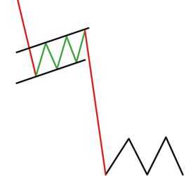
Chart Pattern Breakouts explained
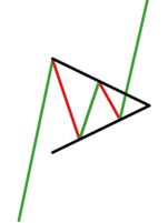
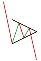
Breakout patterns are formed when the price breaks through a key support or resistance line — signaling a potential start of a new trend. This breakout confirms that the pattern is complete, and traders often view it as a trade signal.
Breakouts can be:
- Bullish: when price breaks above resistance, suggesting upward momentum.
- Bearish: when price breaks below support, indicating downward momentum.
Breakout patterns are commonly used by momentum traders who look to enter trades in the direction of the breakout, aiming to ride the trend early.
Bearish Pattern Breakouts
Bullish Pattern Breakouts
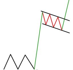
Emerging patterns explained
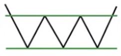
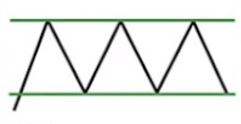
Emerging patterns are formed when the price is still trading within established support and resistance levels — indicating that the pattern is still developing and has not yet broken out.
These setups can present swing trading opportunities:
- Bullish: when price approaches support and shows signs of bouncing upward.
- Bearish: when price nears resistance and begins to reverse downward.
Emerging patterns are favored by swing traders who aim to profit from price oscillating within the range. Traders monitor these setups closely for potential breakouts or to trade the range until a breakout occurs.
Bearish Emerging Patterns Examples
Bullish Emerging Patterns Examples
AI Crypto Chart Patterns Result Types
altFINS features a sophisticated automated chart pattern recognition tool that detects 26 key crypto chart patterns across multiple timeframes (15 min, 1h, 4h, 1d). It saves traders time and highlights high-probability trade setups without the need for manual chart analysis. Learn about those chart patterns and how to trade them:
Ascending Triangle Chart Pattern

Description: Two or more equal highs forming a horizontal line at the top; two or more rising troughs forming an ascending line that meets the horizontal line. It typically forms during an uptrend (bullish).
Trade: A breakout usually follows the direction of the prevailing trend. Most traders enter a position when the price action breaks above the triangle’s upper boundary with increased volume. At this point, the price is expected to rise by an amount equal to the triangle’s widest section.
An Ascending Triangle is a bullish continuation pattern that forms during an uptrend, characterized by a horizontal resistance line and a rising support line. This structure indicates that buyers are gradually gaining strength, pushing the price higher with each pullback, while sellers maintain a consistent resistance level. The pattern often leads to a breakout above the resistance line, continuing the upward trend.
Traders typically look for entry opportunities when the price breaks above the horizontal resistance with strong volume, signaling renewed bullish momentum. The Ascending Triangle is valued for its clarity and reliability, making it a favorite among technical analysts looking to trade breakouts in trending markets. Learn more in this article.
Example of Ascending Triangle Pattern: DigiByte (DGB) has formed an Ascending Triangle pattern, signaling a potential bullish breakout with a projected 11.77% price increase toward $0.01247 over the next 16 days.
Source: altFINS
Explore real-time examples here.
Descending Triangle Chart Pattern
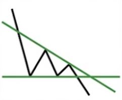
Description: Two or more equal lows forming a horizontal line at the bottom; two or more declining peaks forming a descending line that meets the horizontal line. It typically forms in a downtrend (bearish).
Trade: Typically, a breakout will occur in the direction of the existing trend. Most traders will take a position once the price action breaks through the bottom trendline of the triangle with increased volume, which is when the price should decline an amount equivalent to the widest section of the triangle.
A Descending Triangle is a bearish continuation pattern that typically forms during a downtrend, defined by a flat support level and a descending resistance line. This structure suggests increasing selling pressure, as each bounce off support results in a lower high, signaling weakening buyer momentum. The pattern often leads to a breakdown below the support line, continuing the downward trend.
Traders usually watch for a breakout below the horizontal support with increased volume as a signal to enter short positions. The Descending Triangle is favored for its effectiveness in identifying breakdown setups in bearish market conditions. Learn more in this article.
Example of Descending Triangle Pattern: Radix (XRD) has formed a Descending Triangle pattern, signaling a potential bearish breakdown with a projected 16.07% price decrease toward $0.006767 over the next 10 days.
Source: altFINS
Explore real-time examples of Chart Patterns on altFINS!
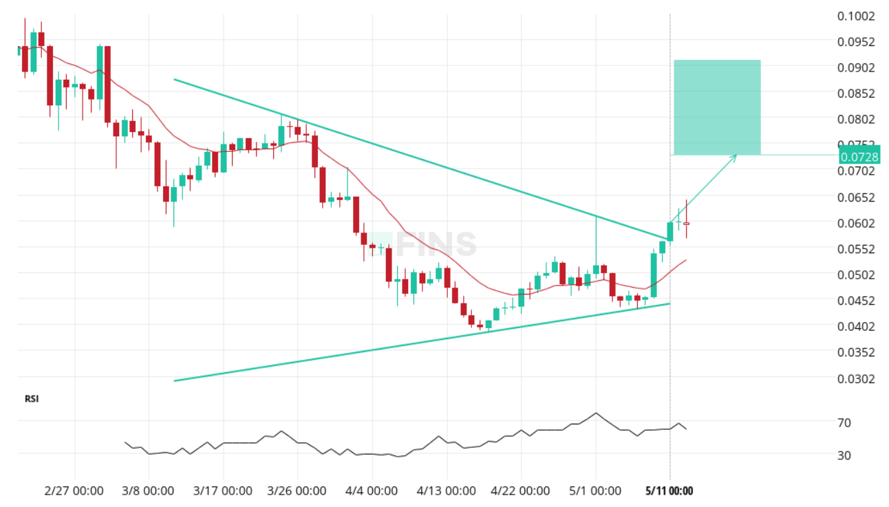
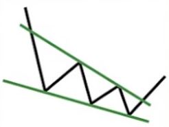
Symmetrical Triangle Chart Pattern
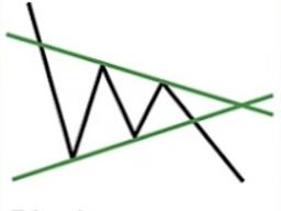
Description: Symmetrical triangles are continuation patterns developed in markets that are without clear direction. During this period of indecision, the highs and the lows come together in the point of the triangle with low volume. Investors just don’t know what position to take. When the investors do finally figure out which way to go, it heads north or south with big volume in comparison to volume leading up to the breakout.
Trade: Enter a trade at the breakout point in the direction of the breakout, which is typically a continuation of previous bigger picture trend.
A Triangle pattern is a consolidation formation that can signal either a continuation or reversal, depending on the breakout direction. It forms when the price moves within converging trendlines, indicating decreasing volatility and a buildup of momentum. In a bullish scenario, a breakout above the upper trendline typically suggests the start of a new upward move.
Traders often use Triangle breakouts as trade signals, entering long positions when the price breaks resistance with strong volume. This pattern is popular for its ability to highlight key breakout points following periods of consolidation. Learn more in this article.
Example of Triangle Pattern: DODO (DODO) has broken out of a Triangle pattern, signaling a bullish move with a potential 26.20% price increase toward $0.0728 over the next 11 days.
Source: altFINS
Explore real-time examples of Chart Patterns on altFINS!
Head and Shoulders Chart Pattern
Description: Three successive peaks: middle is the highest and the two outside lower and relatively equal in height. It forms after an uptrend and often signals upcoming trend reversal (from bullish to bearish). The head and shoulders pattern is believed to be one of the most reliable trend reversal patterns.
Trade: Wait for pattern to complete and price to break out – to move lower than the neckline after the peak of the right shoulder. The most common entry point is when a breakout occurs – the neckline is broken and a SELL trade is taken.
The Head and Shoulders pattern is a classic bearish reversal formation that signals a potential shift from an uptrend to a downtrend. It consists of three peaks: a higher middle peak (the “head”) flanked by two lower peaks (the “shoulders”), with a horizontal or slightly sloping neckline connecting the lows. Once the price breaks below the neckline with strong volume, it typically confirms the trend reversal.
Traders often use this pattern to identify potential shorting opportunities, placing entries on the neckline break and targeting downward price moves. The Head and Shoulders pattern is known for its high reliability and is considered one of the most accurate reversal signals, with a historically strong success rate in bearish market setups.
Find real-time example of altFINS.
Inverse Head and Shoulders Chart Pattern
Description: Three successive peaks: middle is the lowest and the two outside higher and relatively equal in height. It forms after a downtrend and often signals upcoming trend reversal (from bearish to bullish).
Trade: Wait for pattern to complete and price to break out – to move above the neckline. The most common entry point is when a breakout occurs – the neckline is broken and a BUY trade is taken.
This chart pattern has the highest success rate! The Inverse Head and Shoulders pattern is a bullish reversal formation that signals a potential shift from a downtrend to an uptrend. It features three troughs: a lower middle trough (the “head”) between two higher troughs (the “shoulders”), connected by a resistance line known as the neckline. A breakout above the neckline with strong volume typically confirms the reversal and indicates the start of a new upward trend.
Traders use this pattern to identify buying opportunities, often entering positions on the breakout and targeting higher price levels. The Inverse Head and Shoulders is considered one of the most reliable bullish reversal patterns, with a high success rate in signaling sustained upward moves. Learn more in this article.
Example of Inverse Head and Shoulders Pattern: Stellar (XLM) has broken out of an Inverse Head and Shoulders pattern, signaling a bullish move with a potential 12.18% price increase toward $0.3472 over the next 17 days.
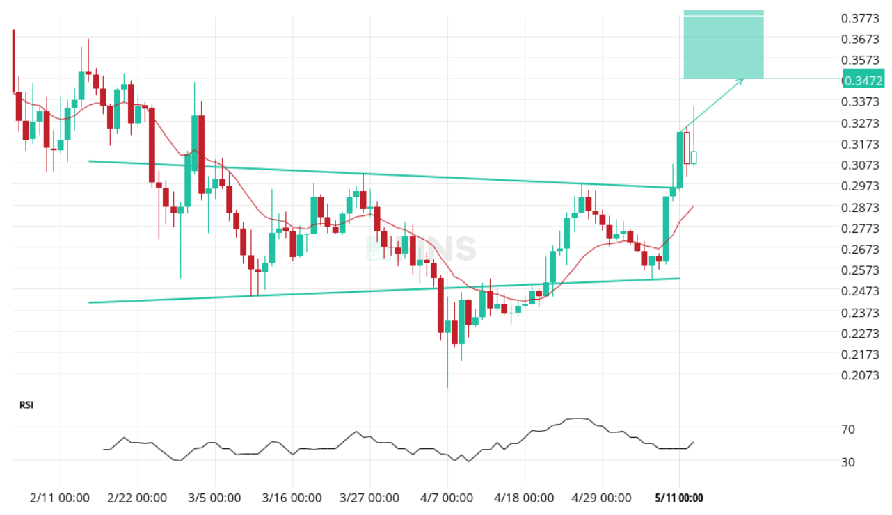
Source: altFINS
Explore real-time examples of Chart Patterns on altFINS!
Learn how to trade Inverse Head and Shoulder Pattern
The inverse head and shoulders chart pattern is a bullish reversal pattern that is formed after a downtrend. It is characterized by a series of three lows, with the middle low being the deepest (the “head”), and the other two lows (the “shoulders”) being shallower and roughly equal in height. The pattern is completed when the price breaks above the neckline, which is a horizontal line drawn through the highs between the two shoulders.
The pattern is called “inverse” because it is the opposite of the traditional head and shoulders pattern, which is a bearish reversal pattern that is formed after an uptrend.
When the inverse head and shoulders pattern is formed, it signals that the downtrend is losing momentum and that buyers are starting to gain control. The pattern suggests that the price may be poised for a significant move to the upside.
Traders typically look for the following characteristics when identifying an inverse head and shoulders pattern:
- The first shoulder should be formed after a downtrend and should be lower than the head.
- The head should be the lowest point in the pattern.
- The second shoulder should be formed after the head and should be roughly equal in height to the first shoulder.
- The neckline should be drawn through the highs between the two shoulders.
- The price should break above the neckline on increasing volume to confirm the pattern
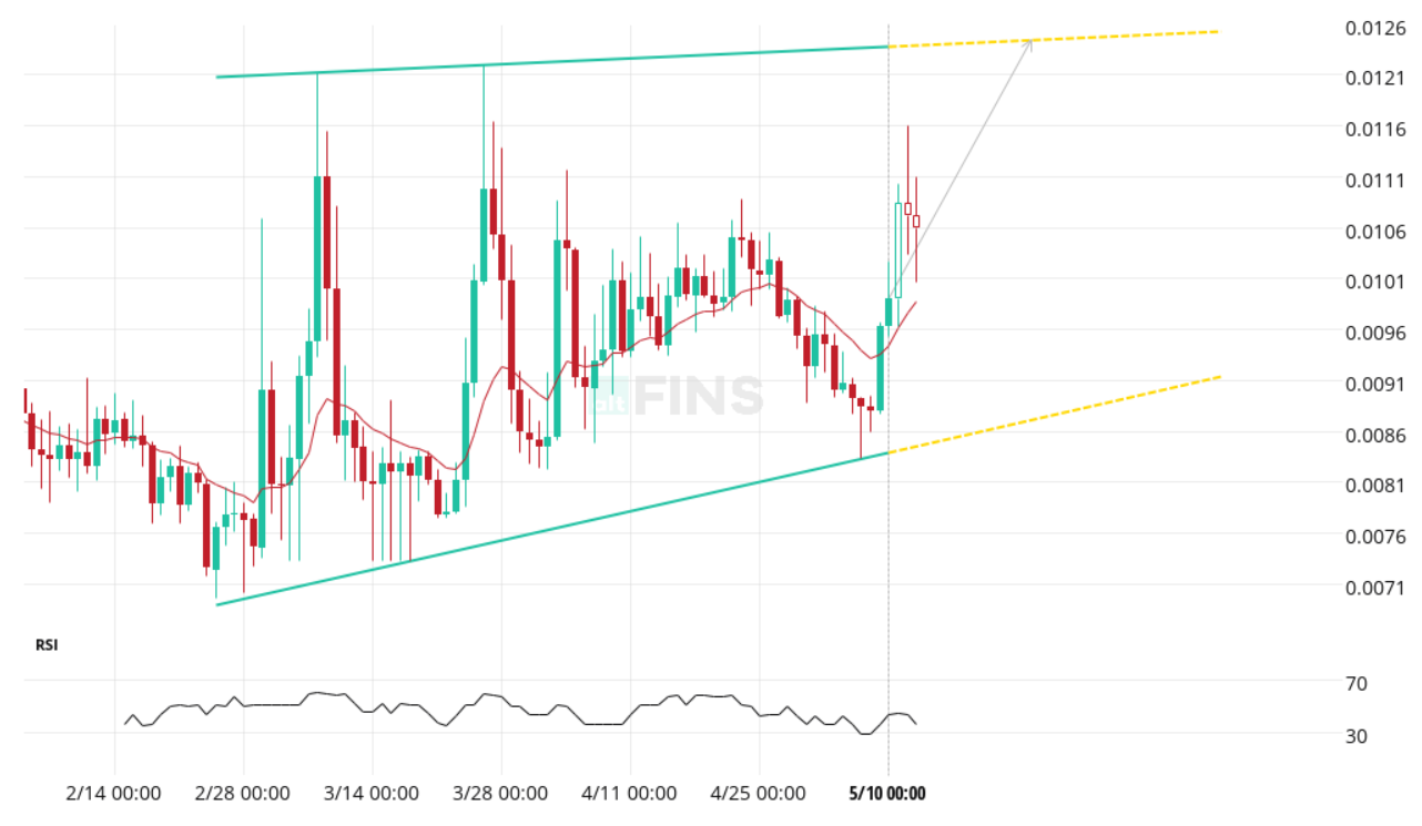
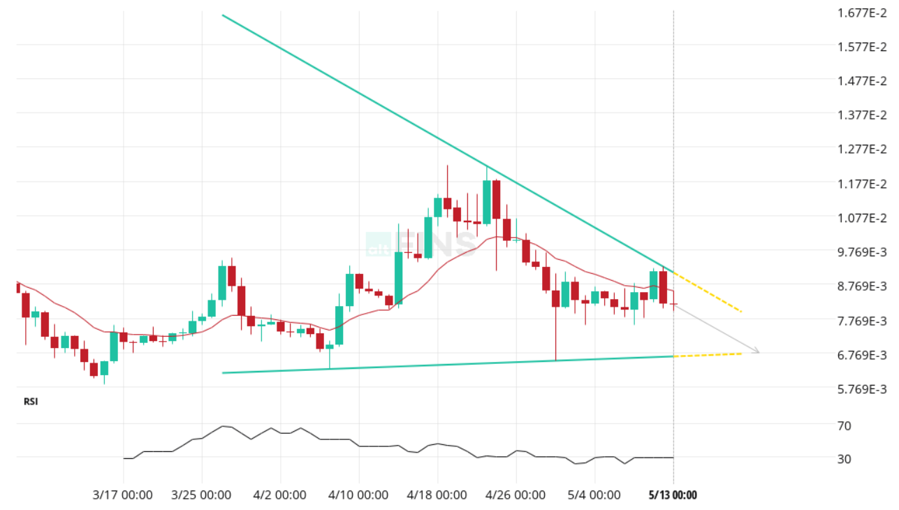
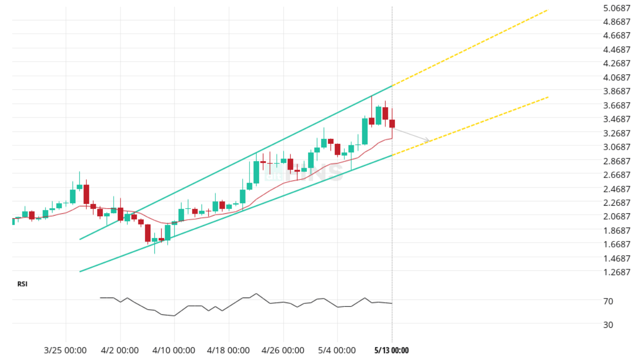
Channel Down and Channel Up Chart Patterns
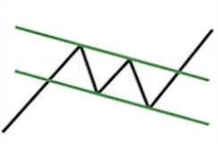
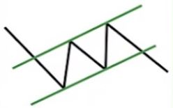
Description: Trading range between diagonal parallel lines. It forms when an up or downtrend is formed between parallel support and resistance lines. It suggests either a possible reversal in the trend or a change in the slope of the current trend.
Trade: 1) with emerging patterns, traders who believe the price is likely to remain within its channel can initiate trades when the price fluctuates within its channel trendlines, 2) with complete patterns (i.e. a breakout) – initiate a trade when the price breaks through the channel’s trendlines, either on the upper or lower side. When this happens, the price can move rapidly in the direction of that breakout.
Channel Down Chart Pattern
A Channel Down pattern is a bearish chart formation that occurs when the price of an asset consistently trends lower, moving between two downward-sloping parallel trendlines. The upper trendline acts as resistance, where selling pressure tends to increase, while the lower trendline serves as support, where buying interest may temporarily halt the decline. This pattern indicates a strong and steady downtrend, marked by lower highs and lower lows over time.
Traders often look to short the asset near the upper boundary and consider covering or taking profits near the lower boundary. If the price breaks below the lower trendline with strong volume, it can signal a continuation of the bearish trend. The Channel Down pattern is widely used by technical analysts for its clear structure and high reliability in trending markets.
Example of Channel Down Pattern – Syscoin (SYS) has formed a Channel Down pattern, signaling a potential bullish reversal with a projected 112.58% price increase toward $0.1284 over the next 84 days.
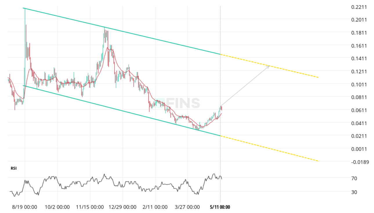
Explore real-time examples of Chart Patterns on altFINS!
Channel Up Chart Pattern
A Channel Up pattern is a bullish chart formation that occurs when the price of an asset consistently moves higher while staying confined between two upward-sloping parallel trendlines. The lower trendline acts as support, where buying pressure tends to come in, and the upper trendline serves as resistance, where selling pressure often appears. This pattern reflects a strong and steady uptrend, with price making higher highs and higher lows over time.
Traders often use the Channel Up pattern to identify buying opportunities near the lower boundary and potential profit-taking zones near the upper boundary. If the price breaks above the upper trendline with strong volume, it can signal a continuation of the bullish trend. This pattern is popular among technical traders because of its clarity and relatively high probability of success in trending markets. Learn more in this article.
Example of Channel Up Pattern: Synapse $SYN has formed a Channel Up pattern, signaling a bullish trend with a potential 76.63% price increase toward $0.5131 over the next 18 days.
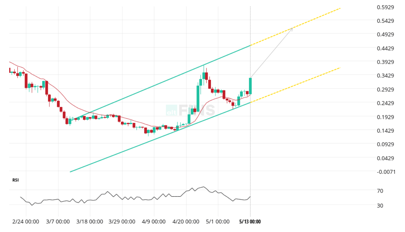
Source: altFINS
Explore real-time examples of Chart Patterns on altFINS!
Bullish and Bearish Flag Chart Patterns
Explanation: Short term (shorter time interval) small rectangle trading range between diagonal parallel lines. It moves counter to the prevailing price trend observed in a longer time frame on a price chart. It forms typically following a sharp advance or decline and often indicates a small change in direction (or areas of consolidation) before the previous trend resumes.
Flag patterns can be either upward trending (bullish flag) or downward trending (bearish flag). Flag pattern is among the most reliable continuation patterns that traders use because it generates a setup for entering an existing trend that is ready to continue.
Trade: Trade is initiated on a breakout, if it is in the same direction as the prevailing trend. Also, with bullish flag patterns, traders prefer a breakout with an increase in volume but it isn’t a must. With bearish flag patterns, the breakout volume may not be that different from the volume preceding it.
Bullish Flag Chart Pattern
A Bullish Flag pattern is a continuation chart formation that appears after a strong upward price movement, followed by a brief period of consolidation that slopes slightly downward or moves sideways. This consolidation forms the “flag,” while the sharp upward movement before it is known as the “flagpole.” Despite the short-term pullback, the pattern reflects a pause in a strong uptrend rather than a reversal.
Traders see the Bullish Flag as a signal that the upward momentum is likely to resume. They often enter long positions when the price breaks above the flag’s upper boundary with increased volume, anticipating a continuation of the previous rally. This pattern is popular for its reliability and clean structure, especially in trending markets, making it a go-to setup for momentum traders. Learn more in this article.
Example of Bullish Flag Pattern: ORCA (ORCA) has formed a Flag pattern, signaling a bullish continuation with a potential 3.38% price increase toward $2.9633 over the next 2 days.
Source: altFINS
Explore real-time examples of Chart Patterns on altFINS!
Watch trading video: Trading Bullish Flag Patterns
In this trading video, Richard, CEO of altFINS, breaks down Bullish Flag patterns using XRP and APT as example trade setups.
The Bullish Flag is one of the most reliable continuation patterns, offering traders a clear setup to join an existing trend poised to continue.
Watch the video to learn his step-by-step approach:
- How to find trade setups on the altFINS platform
- How to identify Bullish Flag patterns
- How to determine Take Profit (TP) and Stop Loss (SL) levels
Bearish Flag Chart Pattern
A Bearish Flag pattern is a continuation chart formation that emerges after a sharp downward price move, followed by a brief consolidation period that slopes slightly upward or moves sideways. This consolidation creates the “flag,” while the preceding steep decline is called the “flagpole.” Despite the short-term pause, the pattern typically signals that the prevailing downtrend is likely to continue.
Traders often view the Bearish Flag as a setup for shorting opportunities. They may enter short positions when the price breaks below the lower boundary of the flag with increased volume, anticipating a continuation of the downward move. This pattern is favored for its clarity and reliability in trending markets, making it a valuable tool for identifying momentum-based short trades. Learn more in this article.
Example of Bearish Flag Pattern: Convex Finance (CVX) has formed a Flag pattern, signaling a bearish continuation with a potential 1.34% price decrease toward $3.1295 over the next 6 days.
Source: altFINS
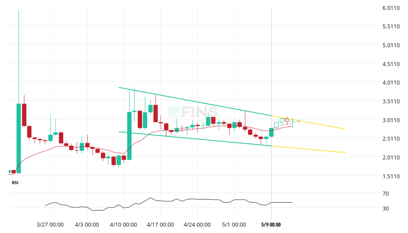
Falling Wedge Chart Pattern
Explanation: Two converging lines slanted downward. It usually forms after a downtrend and suggests a potential bullish reversal in the original downtrend. However, it can also appear in an uptrend, in which case, it indicates a likely continuation of that trend. Either way, Falling Wedge typically results in a bullish breakout. Falling Wedge tends to be a more reliable indicator than a rising wedge.
Trade: When price breaks the upper trend line the price is expected to trend higher. Emerging patterns (before a breakout occurs) can be traded by swing traders between the convergence lines; however, most traders should wait for a completed pattern with a breakout and then place a BUY order.
Discover more about the Falling Wedge pattern in this video.
Falling Wedge Chart Pattern
A Falling Wedge pattern is a bullish reversal chart formation that occurs after a downtrend, characterized by two converging downward-sloping trendlines. As the price compresses within this narrowing range, it signals weakening selling pressure and the potential for a breakout to the upside. The pattern reflects a gradual shift in momentum from bearish to bullish.
Traders often see the Falling Wedge as an early indicator of a trend reversal. A breakout above the upper trendline, especially with rising volume, is typically interpreted as a signal to enter a long position, anticipating a sustained upward move. This pattern is popular for spotting buying opportunities near the end of a downtrend. Learn more in this article.
Example of Falling Wedge Pattern: PNG (PNG) has broken out of a Falling Wedge pattern, signaling a bullish reversal with a potential 31.59% price increase toward $0.2351 over the next 24 days.
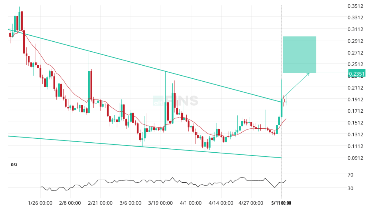
Source: altFINS
Explore real-time examples of Chart Patterns on altFINS!
Rising Wedge Chart Pattern
Explanation: Two converging lines slanted upward. It usually forms after an uptrend but can also occur during a downtrend. There’s usually declining volume as the price rises through the pattern (i.e. price/volume divergence). Rising wedge typically results in a breakdown (bearish).
Trade: Emerging patterns (before a breakout occurs) can be traded by swing traders between the convergence lines; however, most traders should wait for a completed pattern with a breakdown and then place a short sell order.
A Rising Wedge pattern is typically a bearish reversal formation, but it can also appear in bullish scenarios depending on the context. It is formed when the price moves upward within two converging trendlines, indicating a slowing momentum as the highs and lows rise at a decreasing rate. This compression often leads to a breakout—commonly to the downside in downtrends or to the upside in strong bullish markets.
Traders monitor the Rising Wedge closely for breakout signals. In a bullish context, a breakout above the upper trendline with strong volume may suggest the continuation of the upward trend, offering a buying opportunity. This pattern helps traders spot potential trend shifts or continuation points with tightening price action. Learn more in this article.
Example of Rising Wedge Pattern: AURORA (AURORA) has formed a Rising Wedge pattern, signaling a potential bullish continuation with a projected 31.37% price increase toward $0.1280 over the next 12 days.
Source: altFINS
Explore real-time examples of Chart Patterns on altFINS!
Double Bottom Chart Pattern
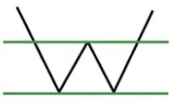
Description: Two consecutive, roughly equal troughs with a moderate peak in between (resembles a “W” shape). This powerful chart pattern occurs after an extended downtrend and often represents a reversal pattern that indicates a minor, if not long term, change from a downtrend to an uptrend (i.e. bullish). A spike in volume often occurs during the two upward price movements in the pattern. These spikes in volume are a strong indication of upward price pressure and help confirm a successful double bottom pattern.
Trade: Place a BUY order when the price breaks through the resistance line (neckline) and completes the pattern.
Explore real-time examples of Chart Patterns on altFINS!

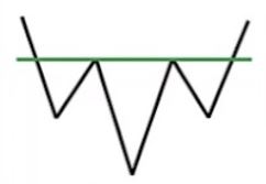
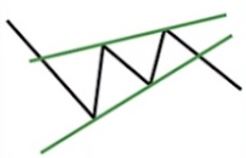
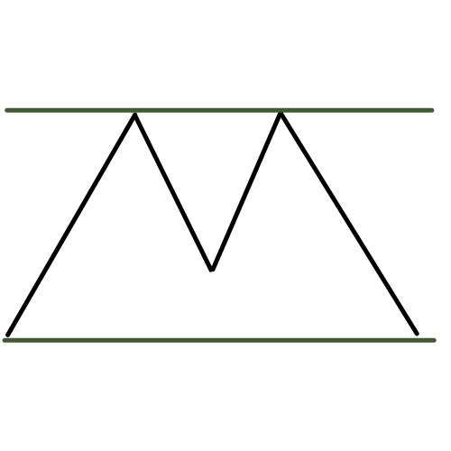
Double Top Chart Pattern
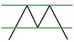
Description: Two consecutive, roughly equal peaks with a moderate trough in between (resembles an “M” shape). This powerful chart pattern occurs after an extended uptrend and often represents a reversal pattern that indicates a minor, if not long term, change from a uptrend to an downtrend (i.e. bearish).
Trade: Place a SELL order when the price breaks through the support line (neckline) and completes the pattern.
Explore real-time examples of Chart Patterns on altFINS!
Triple Bottom
Description: Three consecutive, roughly equal troughs which may at first resemble a double bottom. These troughts represent failed attempts to break through an area of support. Each test of support is typically accompanied by decreasing volume, until a breakout in price occurs with an increase in volume. The pattern occurs after an extended downtrend and often represents a reversal pattern that indicates a minor, if not long term, change from a downtrend to an uptrend (i.e. bullish).
Trade: Place a BUY order when the price breaks through the resistance line and completes the pattern.
Explore real-time examples of Chart Patterns on altFINS!
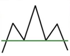
Triple Top
Description: Three consecutive, roughly equal peaks which may at first resemble a double top. These peaks represent failed attempts to break through an area of resistance. Each test of resistance is typically accompanied by decreasing volume, until a breakout in price occurs with an increase in volume. It occurs after an extended uptrend and often represents a reversal pattern that indicates a minor, if not long term, change from an uptrend to a downtrend (i.e. bearish). Trading volume trends should also be employed to confirm the strength of the crypto signal.
Trade: Place a SELL order when the price breaks through the support line and completes the pattern.
Explore real-time examples of Chart Patterns on altFINS!
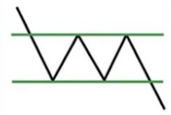
Bullish and Bearish Pennant
Description: A small converging symmetrical triangle (called Pennant). It forms typically following a sharp advance (bullish) / decline (bearish), followed by a brief triangular shaped consolidation in price (a small change in direction), before the previous uptrend (bullish) / downtrend (bearish) resumes. The period of consolidation should have lower volume and the breakouts should occur on higher volume. If there isn’t a flagpole (sharp advance / decline), then it’s a triangle and not a Pennant. Also, Pennants is a short-term pattern, unlike a triangle.
Trade: Traders look for a breakout above the Pennant resistance (bullish) / support (bearish) line to take advantage of the renewed momentum.
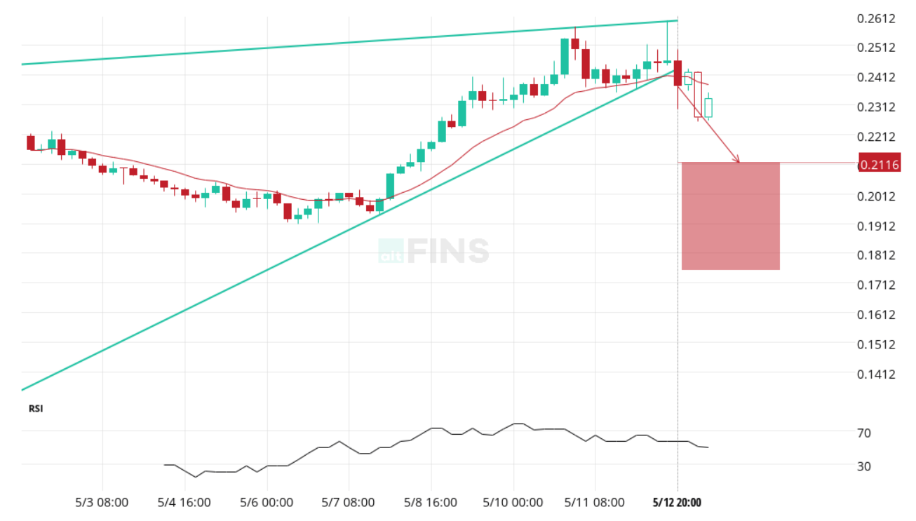
Bearish Pennant Chart Pattern
A Bearish Pennant is a continuation pattern that forms after a strong downward price move, followed by a short period of consolidation within converging trendlines. This “pennant” shape reflects a pause in the trend, with decreasing volatility before the next leg down. A breakdown below the support line with increased volume typically confirms the continuation of the bearish trend.
Traders use this pattern to spot shorting opportunities, often entering positions once the price breaks below the pennant, aiming to capture the next move lower. The Bearish Pennant is favored for its clarity and high success rate in trending markets.
Example of Bearish Pennant Pattern: Algorand (ALGO) has broken out of a Bearish Pennant pattern, signaling a potential 10.59% price decrease toward $0.2116 within the next 19 hours.
Source: altFINS
Explore real-time examples of Chart Patterns on altFINS!
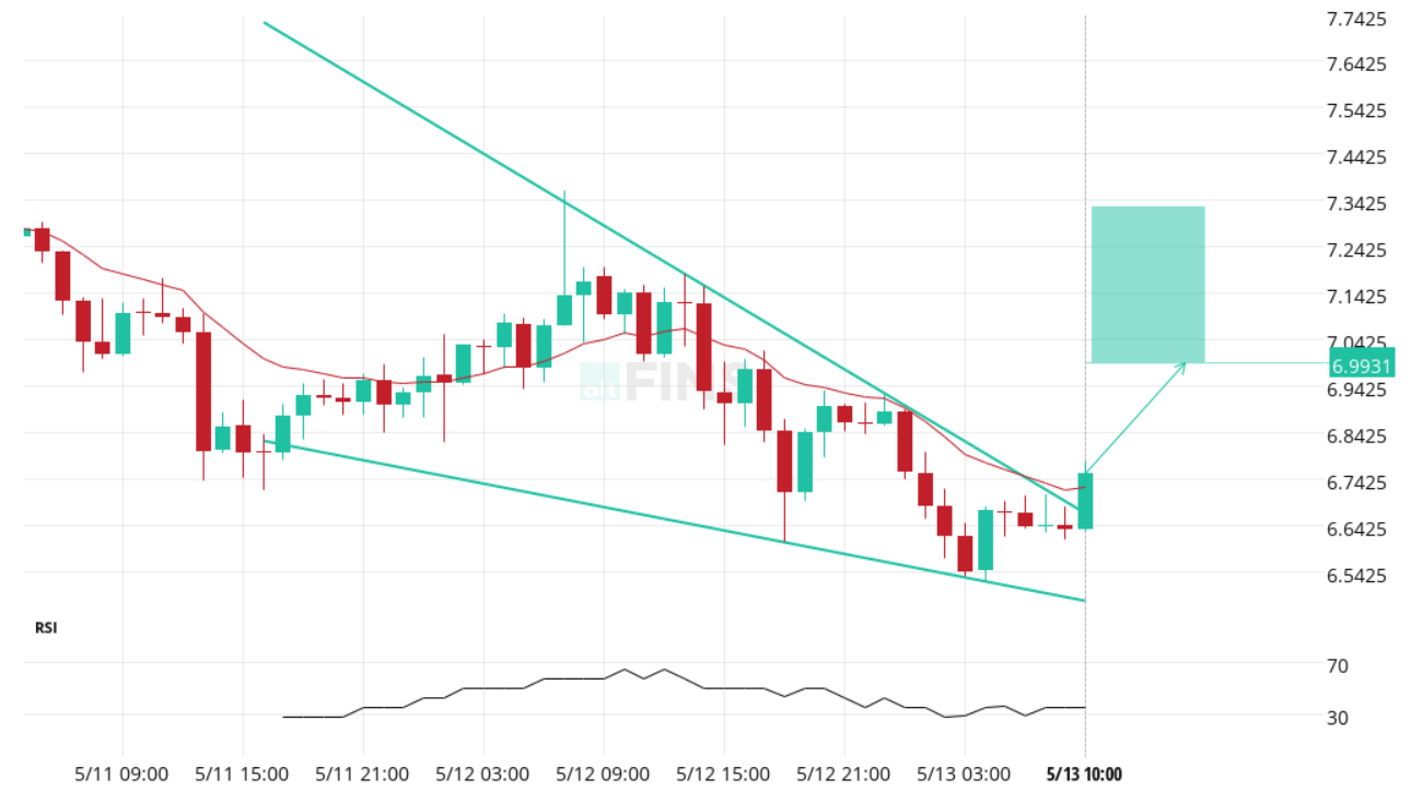
Bullish Pennant Chart Pattern
A Bullish Pennant is a continuation pattern that forms after a strong upward price movement, followed by a brief consolidation within converging trendlines. This pennant-shaped formation signals a temporary pause before the uptrend resumes. A breakout above the upper trendline with strong volume typically confirms the continuation of bullish momentum.
Traders often enter long positions once the price breaks above the pennant, aiming to capture the next upward move. The Bullish Pennant is known for its reliability and is widely used in momentum trading strategies during strong uptrends.
Example of Bullish Pennant Pattern: A Bullish Pennant has broken through the resistance line as of May 13, 10:00 UTC, signaling a potential 3.63% price increase toward 6.9931 within the next 5 hours.
Source: altFINS
Rectangle Chart Pattern
Description: The rectangle pattern characterizes a pause in trend whereby price moves sideways between a parallel support and resistance zone. The pattern usually represents a consolidation in price before continuing in the original direction of the existing trend (up or down).
Trade: A swing trader can trade an emerging rectangle formation by buying at support and selling at resistance. A trend trader just waits for a breakout in the original direction of the trend with a candle close below/above the support/resistance depending on trend direction – enter at the candle close.
Source: altFINS
Explore real-time examples of Chart Patterns on altFINS!
Support / Resistance in Chart Pattern
Description: Key levels are simply horizontal support or resistance areas. This means that the peaks or troughs in the price graph line up to a horizontal psychological barrier. Support and resistance lines are critical concepts in technical analysis. These are areas where buyers deem an asset attractive to buy (support) or too expensive (resistance). Watch a video explaining this concept.
Trade: there are 3 ways to skin this cat:
1. Key level approach
The first type of trade opportunity is when the price has bounced off a key level and moved away, and is now yet again approaching that level.
1.1 Price approaching Support level (Sell signal)
A Support level is a price point where downward momentum often slows down due to increased buying pressure. It represents a zone where buyers have historically stepped in, making it more difficult for the asset to move lower. When the price approaches this level, it signals a potential challenge for bears—but if broken, it can lead to a strong continuation of the downtrend.
Traders monitor approaching support levels to anticipate potential breakdown risks. A confirmed move below support, especially on high volume, is typically seen as a bearish signal. Learn more in this article.
Example of Support Level approach: Lido DAO (LDO) is approaching a key support level at $1.0224, identified on May 13, 10:30 UTC, with a possible 3.04% bearish price movement forecast within the next 19 hours.
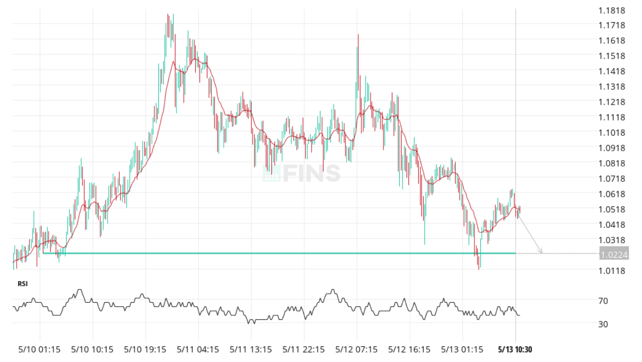
Source: altFINS
Explore real-time examples of Chart Patterns on altFINS!
1.2 Price approaching Resistance level (Buy signal)
When price is approaching Resistance level, that’s an opportunity to profit.
A Resistance level is a price point where upward momentum often slows down due to increased selling pressure. It represents a zone where sellers have historically entered the market, making it more difficult for the asset to move higher. When the price approaches this level, it signals a potential challenge for bulls—but if broken, it can lead to a strong continuation of the uptrend.
Traders monitor approaching resistance levels to anticipate potential breakout opportunities. A successful breakout above resistance, especially on high volume, is typically seen as a bullish signal. Learn more in this article.
Example of Approaching Resistance Level: Celer Network (CELR) is approaching a resistance level at $0.0124, identified on May 13, 0:00 UTC, with a possible 8.25% bullish price movement forecast over the next 61 days.
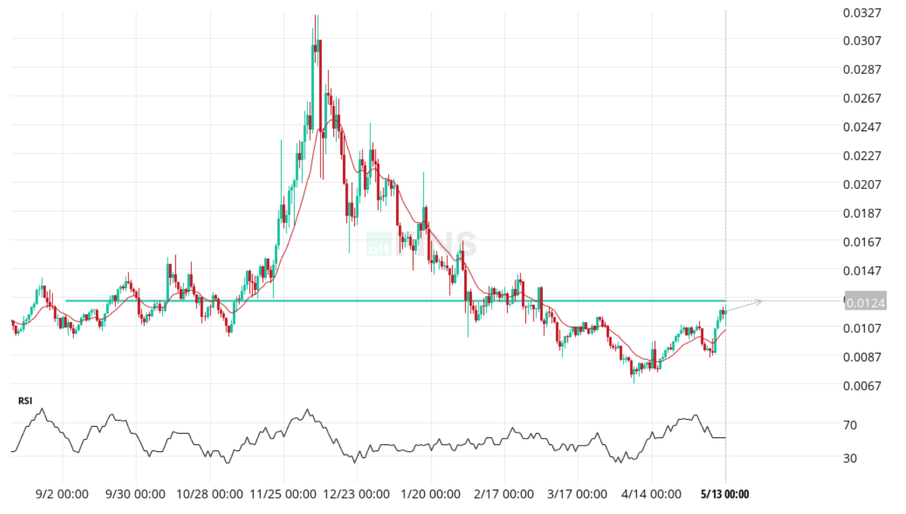
Source: altFINS
Explore real-time examples of Chart Patterns on altFINS!
2. Key level breakout
When key level is breached the theory is that the momentum of the price will carry it some distance beyond the identified level. A breakout is identified when there is a definitive breach of the key level and it is presented together with a target level where one can expect the price to move towards.
2.1 Support level breakout (Sell signal)
A Support level breakout occurs when the price of an asset falls below a historically strong support zone, indicating that selling pressure has overwhelmed buying interest. This breakdown suggests that buyers are no longer able to hold the price above a key level, opening the door for further declines. It often marks the continuation of a bearish trend or the start of a new downtrend.
Traders view support breakouts as a sell signal, especially when accompanied by high trading volume. It’s a key moment for short sellers or for existing holders to consider exiting positions to avoid deeper losses.
Explore real-time examples of Chart Patterns on altFINS!
2.2 Resistance level breakout (Buy signal)
A Resistance level breakout occurs when the price of an asset moves above a historically strong resistance zone, indicating that buying pressure has overcome selling interest. This breakout suggests that bulls have gained control and may push the price higher, often signaling the continuation of an uptrend or the start of a new bullish phase.
Traders view resistance breakouts as a buy signal, particularly when confirmed by strong volume. It’s a key opportunity for momentum traders to enter long positions in anticipation of further upward movement.
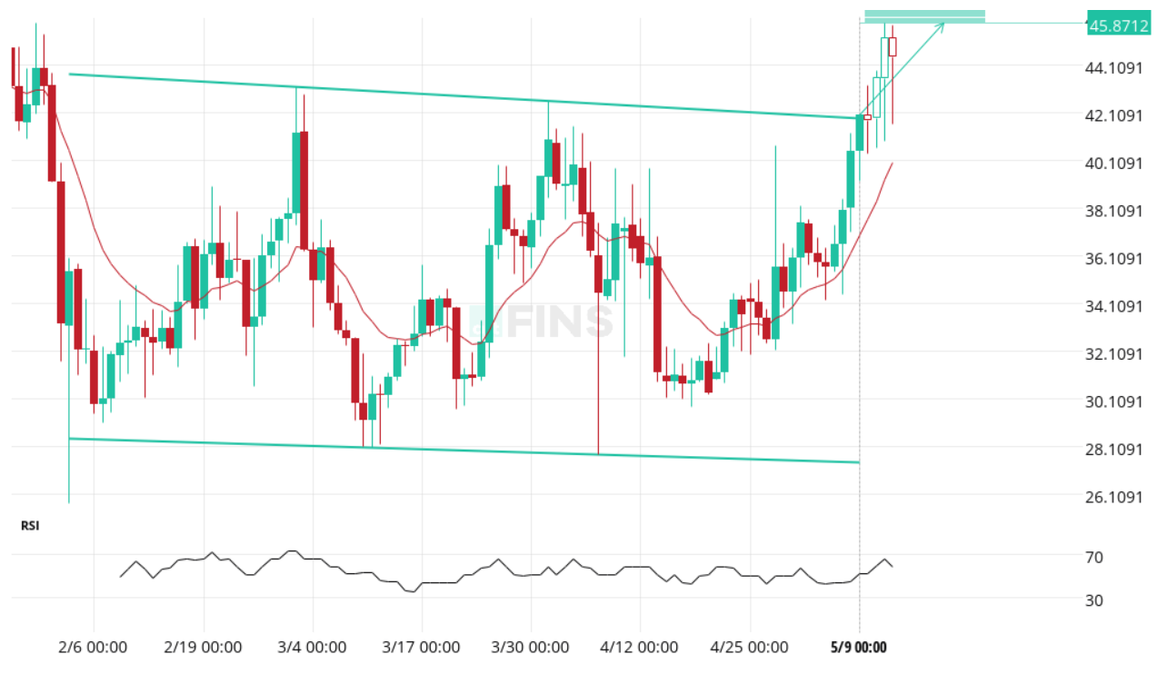
Example of Resistance Breakout: Kusama (KSM) has broken through a key resistance level at $18.4613 as of May 13, 0:00 UTC, signaling a potential 60.38% bullish price movement toward $34.4255 over the next 47 days.
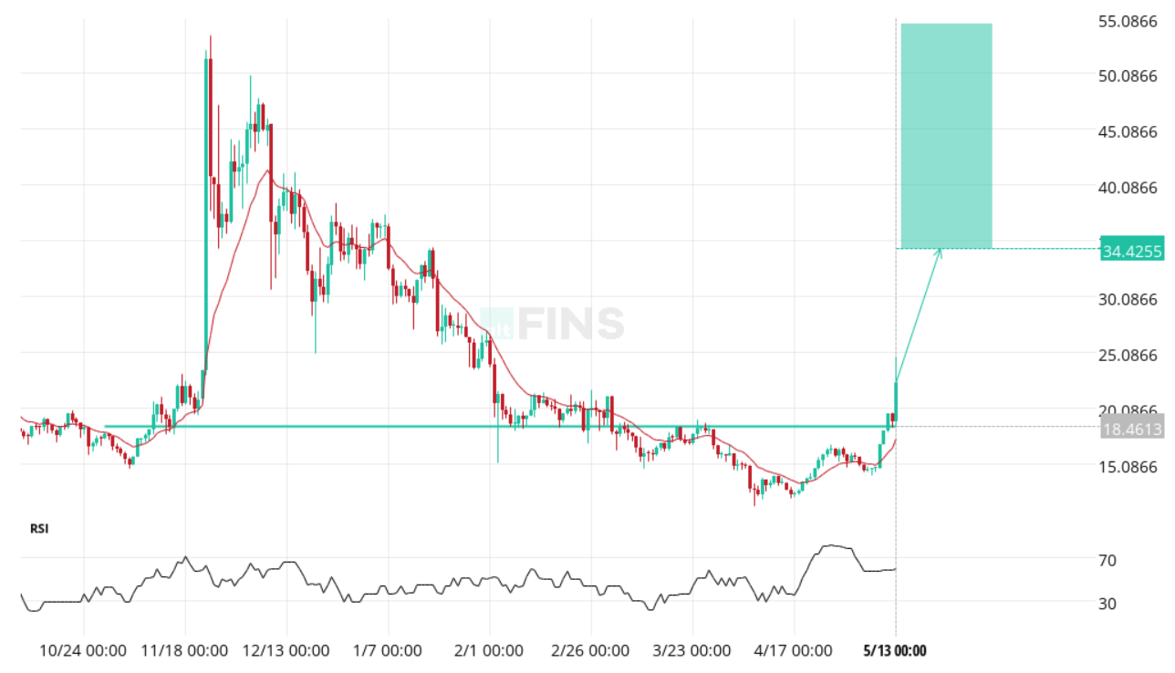
Source: altFINS
Explore real-time examples of Chart Patterns on altFINS!
3. Key level bounce. Most of the time, prices will bounce off of the key horizontal lines, instead of breaking through (trade setup #2 above). So a trader could place an order to go Long when price touches the support line, or go Short (or Sell existing position) when price touches the resistance line.
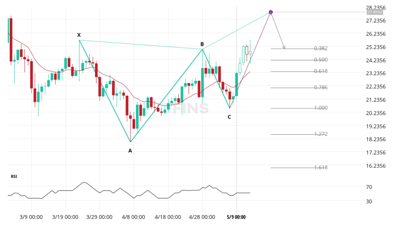
ABCD pattern

Description: ABCD pattern captures the typical rhythmic pattern of the market, which traders use to identify trading opportunities. Since ABCD patterns work on different timeframes, they are widely used and form in both market uptrend and downtrend. ABCD patterns belong to the category of harmonic pattern that consists of two equivalent price legs. Read more about Fibonacci Chart Patterns and Fibonacci Retracement Levels.
Trade: ABCD patterns are easy to identify in a price chart, indicating high probability opportunities. They are used in predicting bullish and bearish reversals.
The ABCD pattern is a classic Fibonacci-based chart formation that signals a potential trend reversal or continuation, depending on its context. In a bullish setup, the pattern consists of three distinct price swings (AB, BC, and CD) where CD mirrors AB in length and time, forming a symmetrical structure. The completion of the CD leg typically indicates a potential price reversal to the upside.
Traders use the ABCD pattern to identify precise entry points, with bullish setups offering attractive risk-to-reward ratios. The pattern becomes more reliable when aligned with Fibonacci retracement and extension levels. Learn more in this article.
Example of ABCD Pattern: GateToken (GT) has formed a bullish ABCD pattern, identified on May 13, 0:00 UTC, with a possible upward price movement toward target levels between $20.9867 and $24.1523 over the next 7 days.
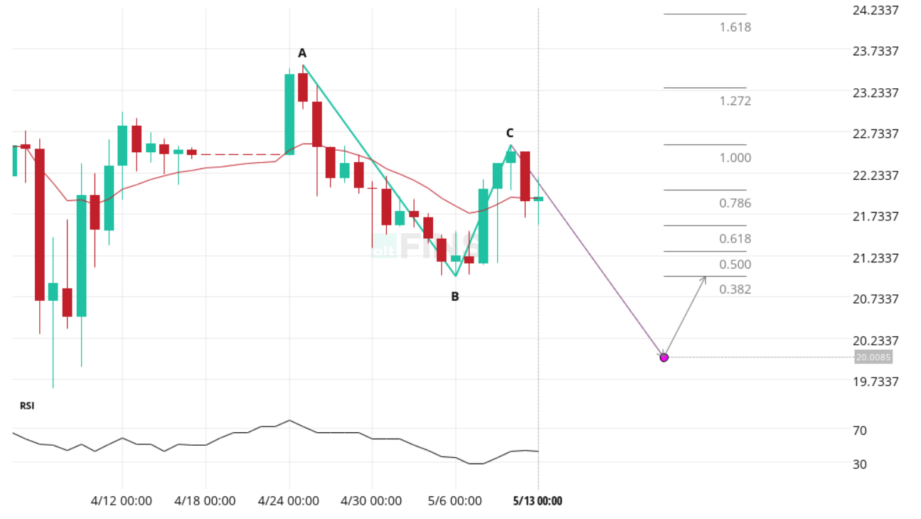
Source: altFINS
Explore real-time examples of Chart Patterns on altFINS!
Butterfly
Description: The butterfly pattern helps you identify the ending of a price movement, meaning that you can enter the market during the reversal of the price.
The Butterfly pattern is an advanced harmonic chart formation that indicates a potential reversal zone based on Fibonacci ratios. In a bullish setup, the pattern consists of four price swings (X-A, A-B, B-C, and C-D), with the final leg (C-D) extending beyond the starting point (X). This deep retracement signals that the market may be overextended, creating an opportunity for a bullish reversal.
Traders use the Butterfly pattern to pinpoint potential reversal areas with high precision, often combining it with other indicators for confirmation. When the price reaches the D point and shows signs of reversal, it can present a strong buy opportunity. Learn more in this article.
Example of Butterfly Pattern: DASH has a bullish Butterfly pattern has been identified, with a potential upward price movement expected from the D point toward the target range. This pattern offers traders a structured setup for entering long positions based on harmonic principles.
Source: altFINS
Explore real-time examples of Chart Patterns on altFINS!
Most Popular Crypto Chart Patterns for Beginners
For those new to crypto trading, some chart patterns are easier to interpret and have higher success rates. Beginners should start with the most reliable crypto chart patterns such as the Inverse Head and Shoulders, Channel Up, and Falling Wedge. These patterns tend to offer clear entry and exit signals, making them ideal for novice traders who are still learning.
10 steps for how to trade crypto using Chart Patterns
We recommend completing Lesson 8 of the Trading Course, which focuses on mastering trading chart patterns.
Key strategies for effectively utilizing chart patterns in trading, including:
-
- Which crypto assets are used for pattern recognition?
- Time interval selection.
- Best patterns for beginners.
- Breakouts vs. Emerging patterns.
- Success rates of various patterns.
- Profit potential.
- When to exit a trade.
- Aligning with trend.
- Risk management.
Let’s first break down the various components of our pattern charts:
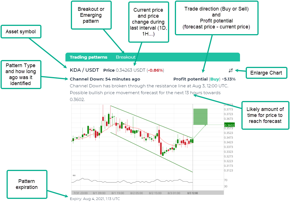
1. Which assets are used for pattern recognition? altFINS analyzes the top 500 coins (by market cap) and this list is updated every quarter.
2. Time interval selection. Patterns are identified over 4 time intervals (1D, 4H, 1H, 15 min). Novice traders should use higher time frames (1D, 4H) while more experienced traders can use lower time frames. It also depends on how much time you have to monitor your positions. Lower time frames (1H, 15 min) require more frequent trade management (monitoring, closing). However, the success rates of the patterns are about the same across these time intervals. So a Horizontal Level Breakout has about the same chance of success on a daily (1D) interval as it does on hourly (1H) interval.
Lower intervals will of course have more patterns forming, more frequently.
Note that Basic plan users get access to 1D interval, Essential users get access to 1D and 4H interval, and Premium users get access to patterns on all four intervals (1D, 4H, 1H, 15 min). More details on subscription plans.

3. Best patterns for beginners. Beginners should stick with the patterns that are easiest to understand and have the highest success rates.
That means: Breakouts (not emerging) + Buy direction + patter types including Horizontal Resistance, Ascending Triangle, Channel Down, Falling Wedge, Inverse Head and Shoulders. Those patterns tend to have 67-83% success rate (see next section).

4. Breakout vs. Emerging Patterns. Read this article in our knowledge base to understand the difference. Overall, Breakout patterns tend to have higher profit potential and are also better suited for beginner traders and Trend traders, while Emerging patterns are good for more advanced and Swing traders.
5. Success rates of various patterns. What does “success rate” mean? It means that price achieved the target within one length of the pattern. So if the pattern was detected over 20 days, then the price target had to be achieved in 20 days after identifying the pattern.
Based on historical backtests, the success rates of the patterns on our platform are as follows:
6. Profit potential. altFINS calculates the profit potential for most of the patterns identified. The calculation is simple. It’s the distance from current live price and the forecast price.
7. The best time to enter a pattern trade is when it’s freshly identified and published on altFINS platform. However, some traders wait for 1-2 candles (1D, 1H…depending on time interval selected) to confirm the price path.
8. When to exit a trade? – when pattern gets removed (becomes inactive). Patterns are removed from our platform when 1) they achieved their forecasted price, 2) after 5 candles have passed (i.e. 5 days, 5 hours…), 3) if price goes too far against the forecasted direction (more than 1 standard deviation=> busted trade).
We recommend 5 candles (days, hours, etc. – depending on time interval used) as the max length of a trade based on historical data, which suggests that forecasted prices are typically reached within 5 candles after identifying a pattern. So if the price has not achieved a forecasted price within 5 candles, trader should close that position.
Traders can create chart pattern alerts. Follow this step-by-step guide.
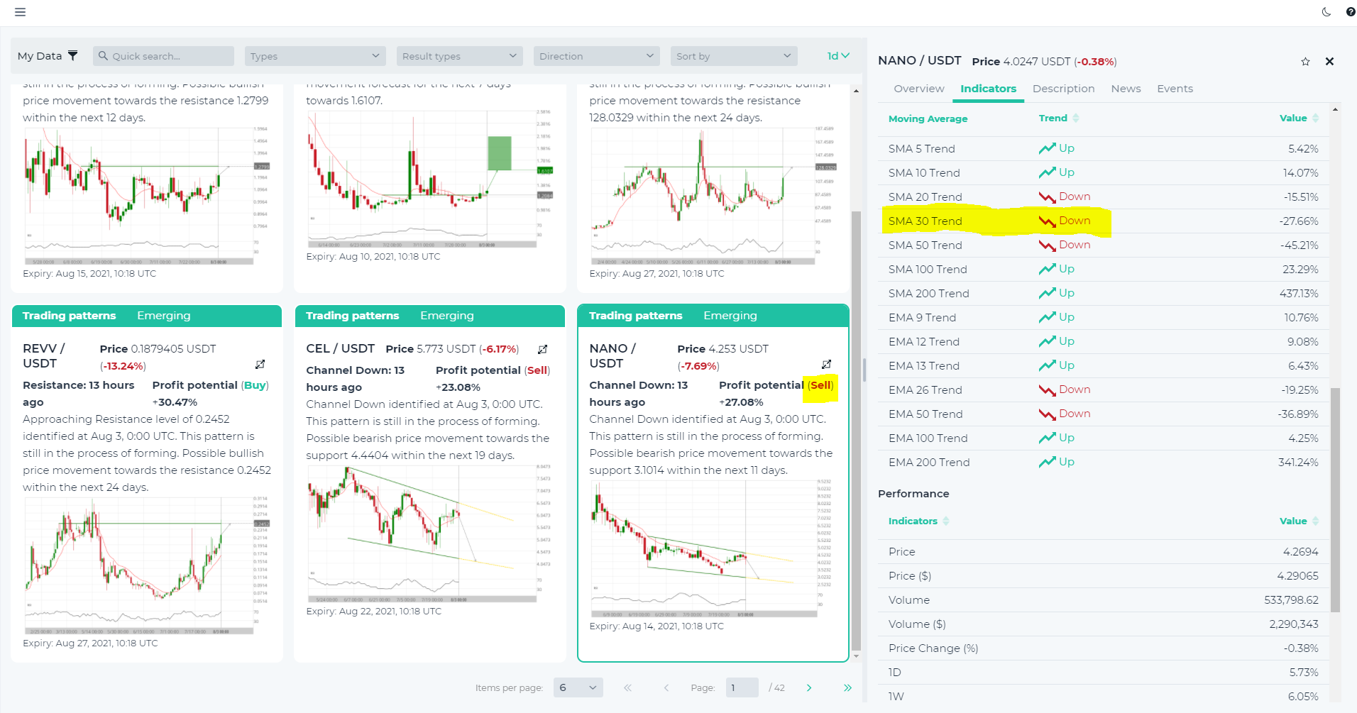
9. Aligning with trend. While this is not an absolute must, it does help increase the success rate. The old adage goes “Trade with trend”. That applies to patterns as well. Market trends change and the success rates of Buy vs. Sell trades are greatly influenced by the overall trend direction. Hence, traders should use Buy direction patterns when the trend is Up, and vice versa. How to identify a trend? We recommend using the slope of a 30-period SMA (simple moving average). You can find that data on altFINS:
10. Risk management. With trading patterns, traders have to do many small trades, instead of few big trades. Because trading is about statistics. Patterns like ascending or descending triangle, channel up or down, resistance break and approach….these have about 70% success rates. That means we’re gonna be 30% of time wrong. So traders need to do a hundred trades for these statistics (success rates) to work out. Keep trades relatively small, don’t bet the farm on any one trade! Don’t use leverage. For additional tips about risk management, read here.
Learn Risk management in the Lesson 9 in Crypto Trading Course.
How to Use Crypto Chart Patterns Effectively
To use chart patterns effectively in crypto trading, it’s important to combine them with technical indicators like RSI (Relative Strength Index) and MACD (Moving Average Convergence Divergence) to confirm trends. When crypto chart patterns such as bullish flags or falling wedges emerge, traders should also pay attention to volume levels. High volume on breakouts can significantly increase the chances of a successful trade, particularly in the volatile crypto space.
Summary
altFINS offers an advanced automated chart pattern recognition engine that identifies 26 common crypto chart patterns across various timeframes (15 min, 1h, 4h, 1d). This powerful feature helps traders save time and spot high-probability trade setups without manually scanning charts.
The platform detects popular patterns such as Head and Shoulders, Double Bottom/Top, Triangles, Flags, Wedges, and even complex harmonic patterns like Gartley and Butterfly.
An internal analysis revealed the most reliable patterns, with Inverse Head and Shoulders (84%), Head and Shoulders (82%), and Double Bottom (82%) showing the highest success rates. Patterns like Pennant (56%) and Rectangle (58%) were found to be less reliable and may require additional confirmation.
By automating pattern recognition and displaying success rates, altFINS equips traders with a strategic edge to make faster, more informed trading decisions.
Learn more about Chart Patterns in altFINS Knowledgebase.
Don’t miss aby trading opportunity and create alerts for chart patterns.
FAQ about Crypto Chart Patterns
What are chart patterns in trading?
Chart patterns are shapes formed by price movements on a chart that traders use to predict future price direction. They help identify whether an asset is likely to continue its trend or reverse. Platforms like altFINS automatically scan hundreds of crypto assets for these formations.
What is the purpose of chart patterns?
The purpose of chart patterns is to simplify market analysis by showing the psychology of buyers and sellers. They help traders spot opportunities to enter, exit, or manage trades. altFINS makes this easier by highlighting real-time bullish and bearish chart setups.
What are the main types of chart patterns?
The main types are:
- Reversal patterns (e.g., head and shoulders, double tops/bottoms) that signal trend changes.
- Continuation patterns (e.g., flags, pennants, triangles) that suggest the trend will continue.
- Neutral patterns (e.g., symmetrical triangles) that can break either way.
Why do chart patterns work?
Chart patterns work because they reflect collective market psychology. When traders worldwide act on the same signals, these patterns often become self-fulfilling. With altFINS, you don’t have to manually search — the platform continuously detects and updates chart pattern breakouts. See all chart patterns here.
Why are chart patterns important in crypto trading?
Crypto markets are fast-moving and volatile. Chart patterns give traders a structured way to analyze price action, reduce noise, and spot high-probability setups.
How do you identify chart patterns?
Chart patterns are identified by spotting recurring formations in price movement, such as triangles, wedges, or channels. Doing this manually takes time, but altFINS automatically scans the crypto market for chart patterns, saving traders hours of work.
How do you trade chart patterns?
To trade a chart pattern, wait for a confirmed breakout or breakdown. Enter the trade in the direction of the move, set stop-losses to manage risk, and use measured targets to estimate potential profit. On altFINS, traders can set alerts when patterns complete or confirm.
How accurate are chart patterns?
Chart patterns vary in accuracy. Some, like the head and shoulders or double bottom, have historically high success rates. However, no pattern is 100% reliable. That’s why altFINS combines chart patterns with indicators like RSI and MACD for confirmation.
How many chart patterns should a trader know?
You don’t need to memorize all of them. Focusing on 8–10 common patterns (triangles, flags, wedges, head and shoulders, double top/bottom) is enough for most traders. altFINS covers 26- the most popular and reliable patterns, so you can focus on execution rather than memorization.
How can beginners learn chart patterns quickly?
Beginners can learn chart patterns by studying cheat sheets, practicing on demo accounts, and reviewing historical charts.
Download altFINS Mobile App
Follow us on:
✅ Telegram: https://t.me/altfinsofficialchat
✅ Twitter: https://twitter.com/AltfinsA
✅ Discord: https://t.co/uBvlTWgRgP
✅ Facebook: https://www.facebook.com/altFINS
✅ YouTube: https://t.co/QCvKBODSKH
✅ Reddit: https://www.reddit.com/user/altFINS_official
✅ Instagram: https://www.instagram.com/altfins_altcoins/
✅ LinkedIn: https://www.linkedin.com/company/altfins