


What Does a Volume Footprint Chart Reveal That Crypto Candlesticks Hide?
Every crypto candlestick compresses a full trading session into four prices and a single color. You get the open, the high, the low, and the close, plus a body that leans green or red. That summary is handy for a quick glance, but it discards almost everything that happened between the first tick and the last. Two candles can look identical on the chart and still mean completely opposite things.
Think about a green bar on Bitcoin that closes near its high. It looks like clean buying. The same shape can form when sellers dumped size all session and buyers only clawed it back in the last thirty seconds. The candle hides which story is true. That missing detail is where a different kind of chart comes in.
The Four Numbers a Candle Gives You
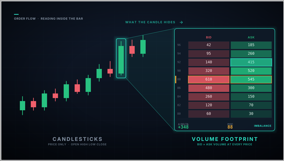
A candle answers a narrow set of questions. How far did the price travel, and in which direction? What it never shows is how the volume inside that range was spread out, or which side was doing the pushing. That gap is what a volume footprint chart like this fills by breaking each bar into the trades that printed at every individual price level. The result reads less like a summary and more like a transcript of the session.
For each price, the footprint shows how much volume traded there. It also splits that volume into trades that hit the bid and trades that lifted the ask. Buyers who cross the spread to get filled land on the ask side. Sellers who hammer the bid land on the other.
That split is the whole point. Price can tick up on light, hesitant buying or on a wall of aggressive market orders, and only the bid-versus-ask breakdown tells you which. The candle finally has an inside you can read.
What Candlesticks Leave Out
Once you can read inside the bar, the limits of a plain candle get obvious fast. A green candle tells you buyers won the period overall. It says nothing about whether they won comfortably or scraped back from a steep sell-off in the final minutes.
Here is what a candle doesn’t show:
- Where inside the range most of the volume actually changed hands
- Whether aggressive buyers or aggressive sellers drove each leg of the move
- The running difference between buying and selling pressure, called delta
- Prices where a wave of market orders hit a wall and barely budged
- Thin levels the market tore through on almost no volume at all.
Each point can flip how you read the exact same move. A trader working from candles alone is reacting to the outcome. A trader reading volume is watching the process that produced it. That is the gap between seeing the result and understanding the cause.
How a Footprint Breaks a Candle Apart
The difference is clearest side by side. A candlestick and a footprint can describe the very same minute of Bitcoin trading, and one hands you four numbers while the other hands you dozens.
| Data point | Candlestick | Footprint chart |
| Direction and close | Shown | Shown |
| Total range, high to low | Shown | Shown |
| Total volume for the bar | Only as a separate volume bar | Shown at every price |
| Volume at each price level | Hidden | Shown |
| Bid versus ask split | Hidden | Shown per level |
| Delta, the net pressure | Hidden | Shown |
| Point of control, the busiest price | Hidden | Marked |
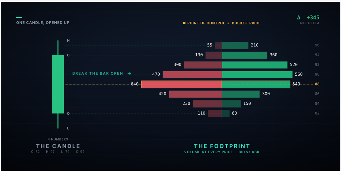
The point of control (the busiest price) is where a footprint starts to pay off. Heavy-volume levels tend to act as magnets and barriers on later moves, which makes them steadier reference points than a line you sketch by hand. They give you a data-backed way to map support and resistance rather than guessing where a level really sits.
Delta deserves its own look. When a bar closes green but delta is negative, more volume traded into the bid than the ask, meaning the move up happened despite net selling. That kind of divergence between price and pressure is a warning that you can’t notice in a candle.
The shape of volume within the bar matters too. A footprint that is fat in the middle and thin at the edges points to balance. On the other hand, one stacked heavily near the low hints at sellers running out of room. These profiles shift as the bar forms, so you watch intent build in real time instead of reading it after the close.
One footprint is a snapshot. A run of them is a story: aggression fading near a high, delta flipping positive at a low, the same price rejected again and again. You get a real edge by reading the sequence, not a single bar.
How Absorption and Imbalance Appear
Two of the most useful reads on a footprint have no candlestick equivalent at all. The first is absorption. Picture heavy selling slamming into one price while the market refuses to drop lower. A large resting buyer is quietly soaking up every market sell order that arrives. On a candle, you would spot a long lower wick and guess; on a footprint, you see the exact volume being eaten.
The second is imbalance. When the volume traded on the ask at one price dwarfs the volume on the bid just below it, that lopsided print shows one side is firmly in control. These diagonal imbalances are a core part of how order flow signals intent well before price confirms it.
Put the two together and fakeouts get easier to catch. A breakout with no absorption at the prior high and a stack of buy imbalances behind it tends to hold. A breakout on thin volume, with sellers quietly absorbing every push, tends to fail. The candle looks the same in both cases.
Why the Inside of the Bar Matters More in Crypto
The stakes can be higher in crypto because markets run around the clock, liquidity can thin out in seconds, and a single large wallet can shove a mid-cap token several percent on a calm day. A plain candle smooths over that noise. A footprint puts it on display. Spoofing and sudden liquidity gaps are common, and the inside of the bar is where they show up first.
A few situations where reading inside the bar earns its place in crypto:
- A breakout candle looks powerful, yet the footprint shows thin volume and no real aggression behind it. Usually a trap.
- Price stalls under resistance while delta keeps climbing, a hint that buyers are absorbing supply before a push higher.
- A violent wick down prints enormous bid-side volume, marking where big players stepped in instead of panicking out.
- A dull range hides a steady one-sided imbalance that front-runs the eventual break.
Volume confirmation like this slots neatly beside the classic chart patterns most crypto traders already track. A triangle or a double bottom becomes far more convincing when real buying pressure shows up inside the breakout bar rather than after it.
The same logic catches liquidation cascades. When a wick prints outsized volume into one side and delta snaps back hard, that is usually forced selling being absorbed rather than a genuine change in trend.
Where the Footprint Fits in a Full Read
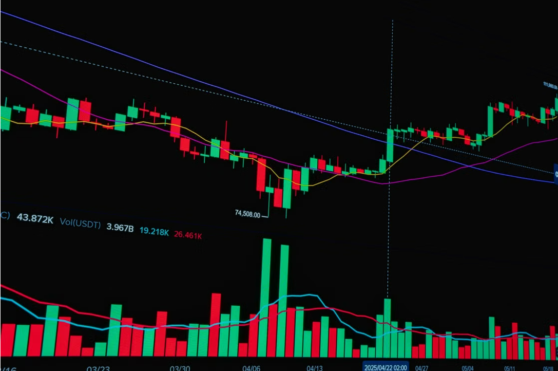
On its own, a footprint is all detail and no context. It shows you exactly what happened inside one bar and next to nothing about where the price has been or which way the trend leans. Rely on it alone through a quiet, sideways session, and it will throw a dozen signals at you, most of them noise.
So it works best as one input among several. Line up a footprint showing selling drying out with a level that has already held once, and a momentum reading that agrees, and a single observation turns into a read you can actually act on. Any one of those on its own is thin, but together, they back each other up.
None of this clicks on day one. Bid and ask columns, delta, shifting imbalances — read in real time, it is a lot to take in, and most people feel buried at first. The usual fix is to slow down: higher timeframes, one signal at a time, absorption first. Hours spent replaying old sessions help more than any shortcut.
From Summary to Structure
Candlesticks are still useful for many traders. They are a summary, and a summary hides the mechanics underneath. A footprint restores those mechanics, laying out the volume, the aggression, and the intent packed into each bar. If you want to weigh the tools built specifically for this kind of analysis, a solid round-up is available here, and it is worth a look before you commit to one.
Read the chart this way for a few weeks, and the candles stop being the whole story. You finally see who is doing the buying and the selling.
 Written byLenka Fetyko
0 Comments
Leave a comment